SSZTCR5 may 2015 CSD19536KTT
Welcome back, fellow FET enthusiasts to part two of the "Understanding MOSFET Data Sheets" blog series! As a product marketing engineer for power MOSFETs, I probably get more questions about the Safe Operating Area (SOA) curve than maybe any other topic on the FET datasheet, with the exception of current ratings (which not so coincidentally will be the topic of the next blog in this series). It’s a tricky terrain to navigate, as every vendor has their own methodology for generating an SOA curve, and its value in providing useful information is directly proportional to the datasheet reader’s ability to interpret said information. While perhaps most useful for hot swap applications where the FET is deliberately operated in its saturation region, more and more, we see other customers for motor control and even power supply using this graph as an indicator of overall robustness and the FET’s ability to handle high amounts of power. Note that if you are more of a visual learner, you can watch the video "Understanding MOSFET datasheets: Safe Operating Area (SOA)".
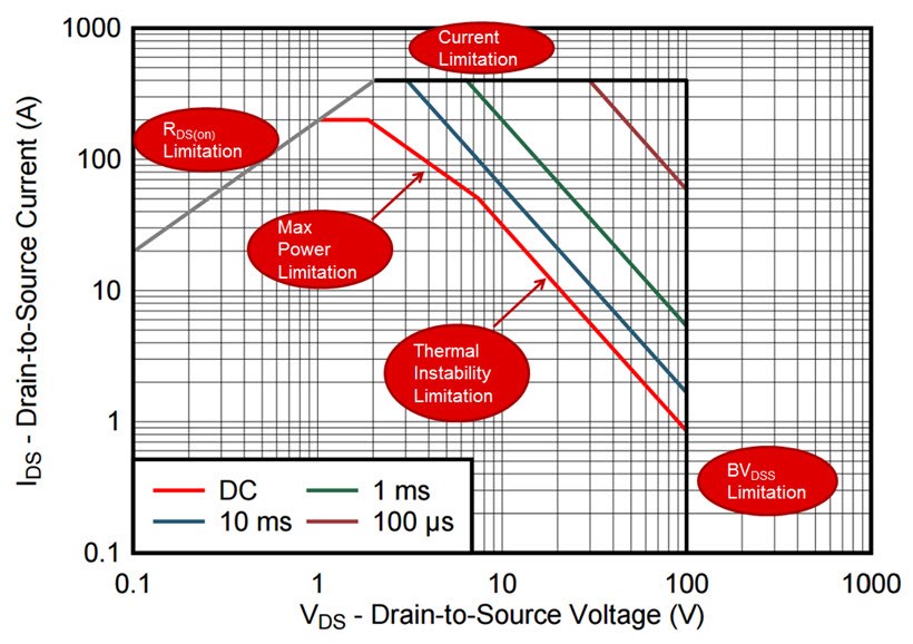
The entire SOA can be drawn from five distinct limitations, each of which shape the overall curve, as shown in Figure 1, the SOA for TI’s 100V D2PAK CSD19536KTT as it appears on the part’s data sheet. Four of these can be easily calculated from the known FET parameters – the RDS(on) limit, the current limits, the max power limits, and the BVDSS limit. Only the thermal instability region presents a problem. This portion of the SOA, noted by where the curve deviates from the constant power line that necessarily has a slope of -1 on a current vs. voltage log-log scale, indicates where thermal runaway can occur, and the steeper the slope, the more prone the FET is to enter this thermal runaway condition at higher breakdown voltages. When FET vendors attempt to calculate this, there is a tendency to either grossly understate or overstate the FET’s current capability in this region, because there is simply no way of knowing the slope of the line without measuring it.
 Figure 1 Datasheet SOA of the CSD19536KTT
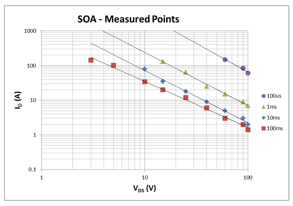
TI owns one of the most powerful SOA testers on the market, capable of pushing several kW of power through a FET for pulse durations all the way down to 100µs. To produce the data sheet curves, FETs are repeatedly pushed to their breaking point for each pulse duration across a range of voltages, and the data comes out looking like what is shown below in Figure 2. Each point represents a different CSD19536KTT device that was pulsed to failure, and from this, the slope and height of the thermal runaway lines can be determined.
 Figure 2 Measured Failure Points of the
CSD19536KTT
Figure 2 Measured Failure Points of the
CSD19536KTTAs a final guarantee of the reliability of our SOA curve, we de-rate each measured thermal runaway line anywhere from 30-40%, depending on how much part to part variation we see. So when you are comparing our FETs’ datasheets to competitors’, be wary of the fact that they may not be as conservative. We have seen some vendors who are. We have seen others who publish the actual failure points and claim this as their guaranteed SOA. There is no industry standard and the truth is without the underlying data demonstrating where parts actually failed, it is impossible to know which part is more reliable from the datasheet SOA curves alone.
In part three of “Understanding MOSFET data sheets,” I will address those pesky current limitations that appear on the front page of all MOSFET datasheets, demonstrating how they are derived and illustrating their practical use for designers. In the meantime, watch a video "NexFET™: Lowest Rdson 80 and 100V TO-220 MOSFETs in the World" and consider one of TI’s NexFET power MOSFET products for your next design.